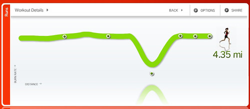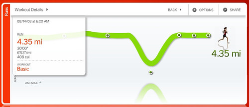
With stats:

Yet when I copy and paste the code here this is what you see:
While my running stats are the same across each graph that damn squiggly line is totally annoying me. Mind you neither of these representations are completely correct. During my run I gradually increase my speed so in a perfect world the graph would reflect a steady incline in the little green line.
I'm hoping to get into the gym for one more run tomorrow morning. With Boot Camp on Saturday (at the Santa Monica Stairs if anyone cares to join) followed by my multi-hour hair appointment with Kelly (my Playa Braid Magician) it's doubtful that I'll be able to squeeze any more training into my nutty schedule before blast off! Yeow! Too few days and counting...
No comments:
Post a Comment
Share a thought...account not required!
*NOTE: Due to SPAM abuse I'm now moderating comments.